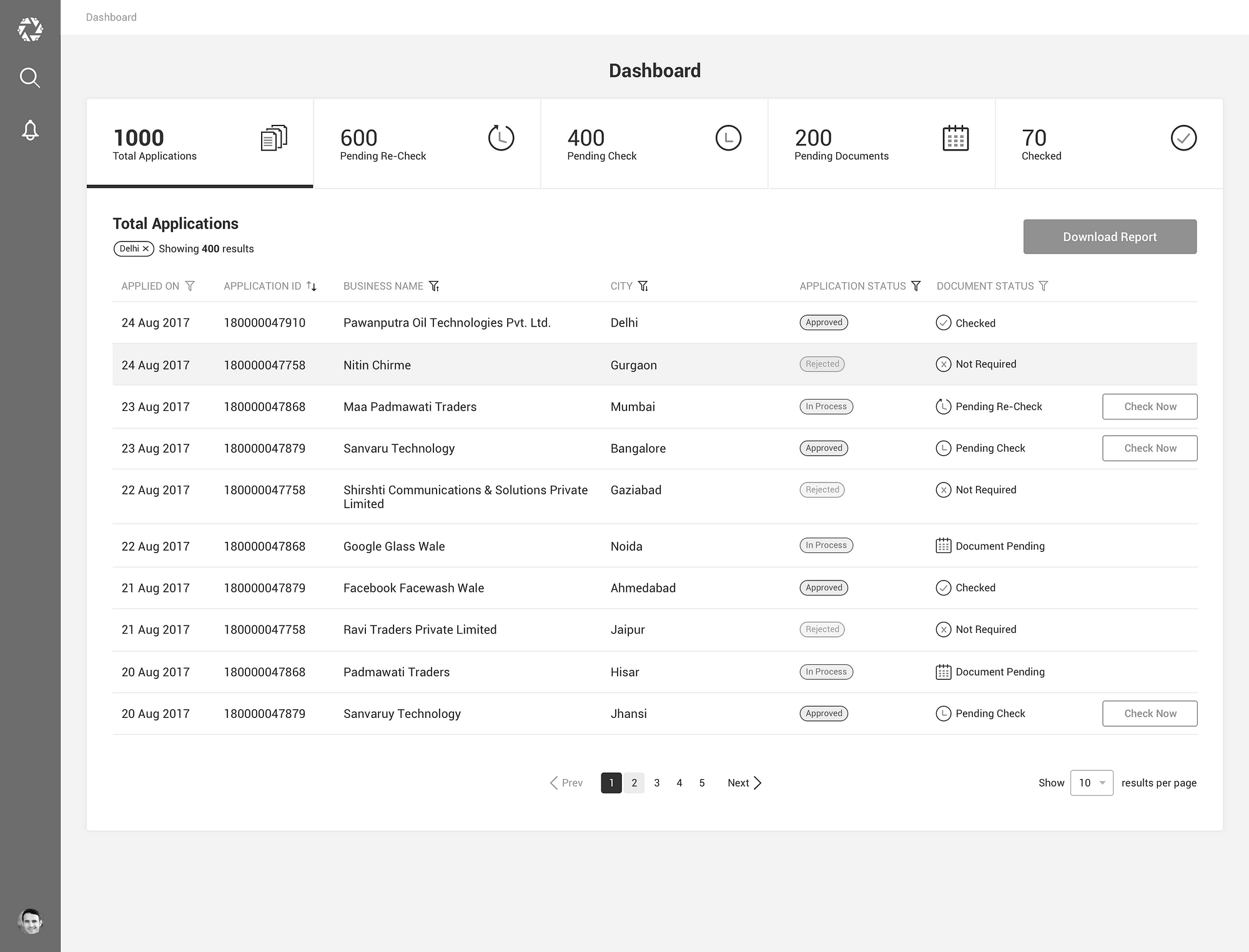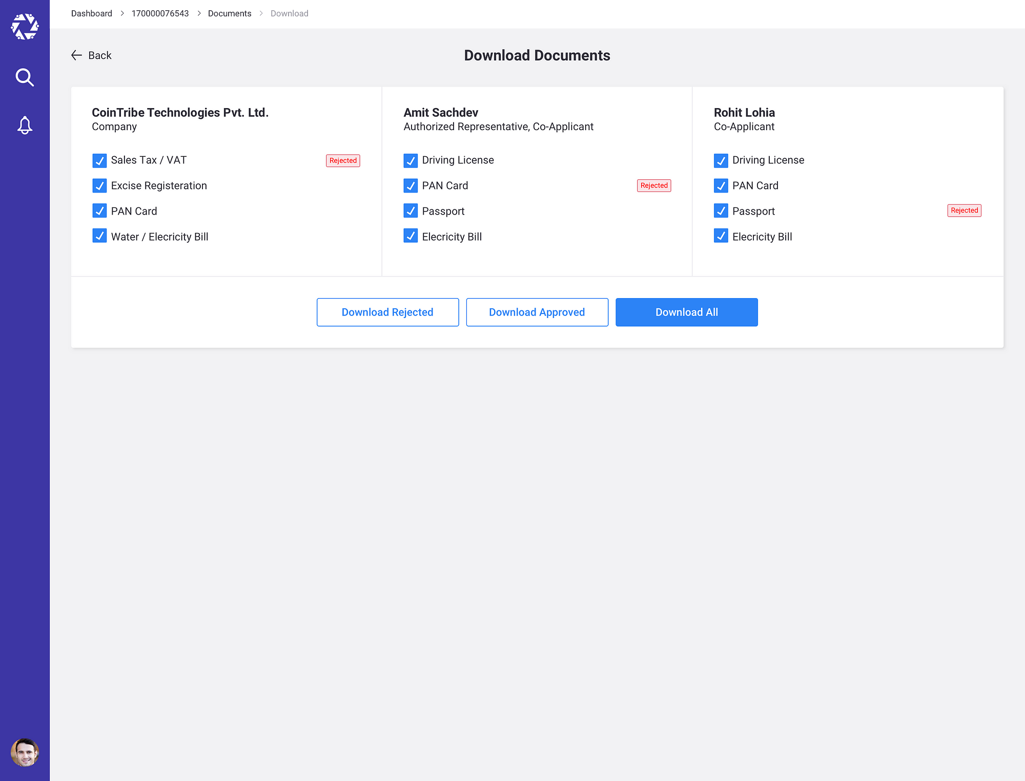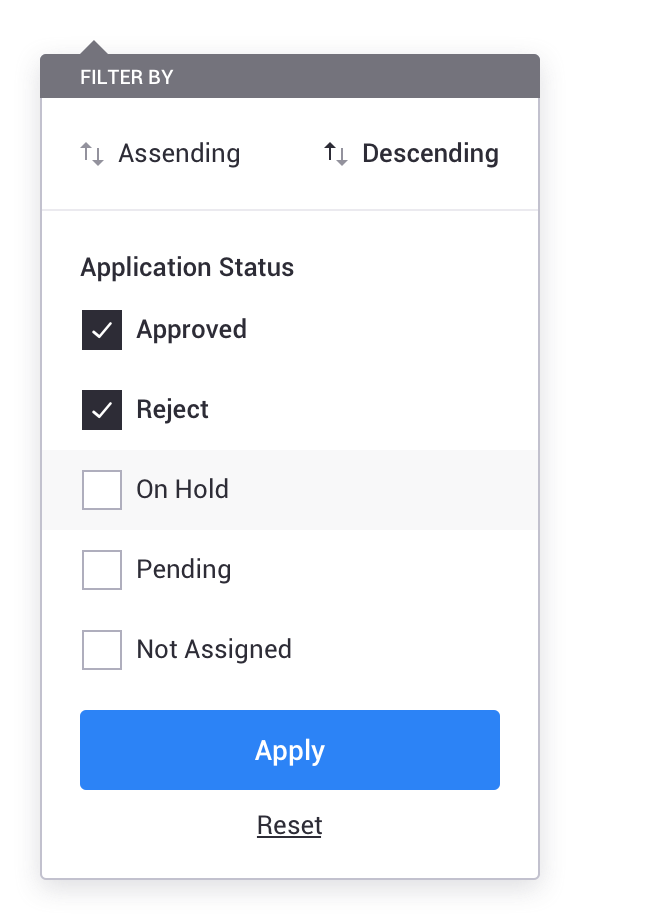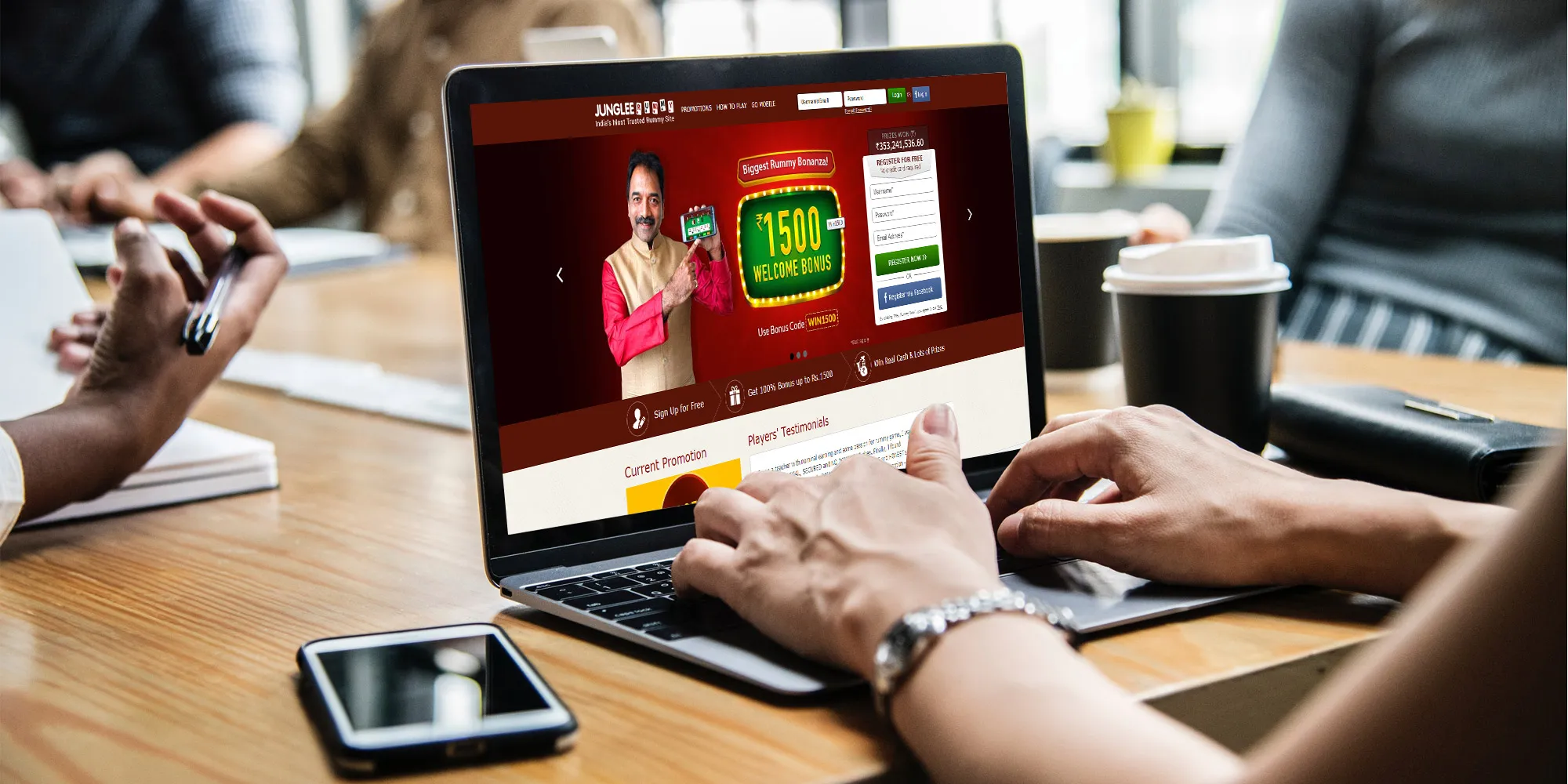
About junglerummy.com:
Jungleerummy.com is the ultimate online rummy site for all rummy players. Experience a unique gaming environment and challenge other players from all over the country. We offer great opportunities for you to utilize your game skills and win real cash and exciting prizes.
Design Interview:
The brief of the design interview was to conduct the UI/UX Review of junglerummy.com.
Tasks:
- Create an account
- On mobile rummy > Game Table Screen, What kind of UI changes you want to do and why?
- On mobile rummy > How can you change the Game Table UX without changing UI?
- On mobile rummy > Create an inviting/ attractive Home Screen Design for m.jungleerummy.com?
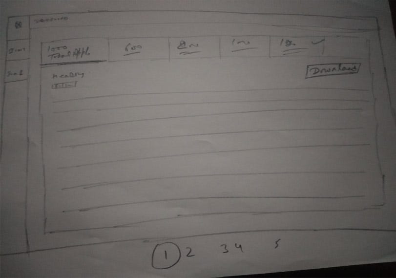
- On Desktop Rummy >As a new user, How do you perceive the information on Home Page www.jungleerummy.com? Suggest 5 major changes you want to do and Why?
Let Starts
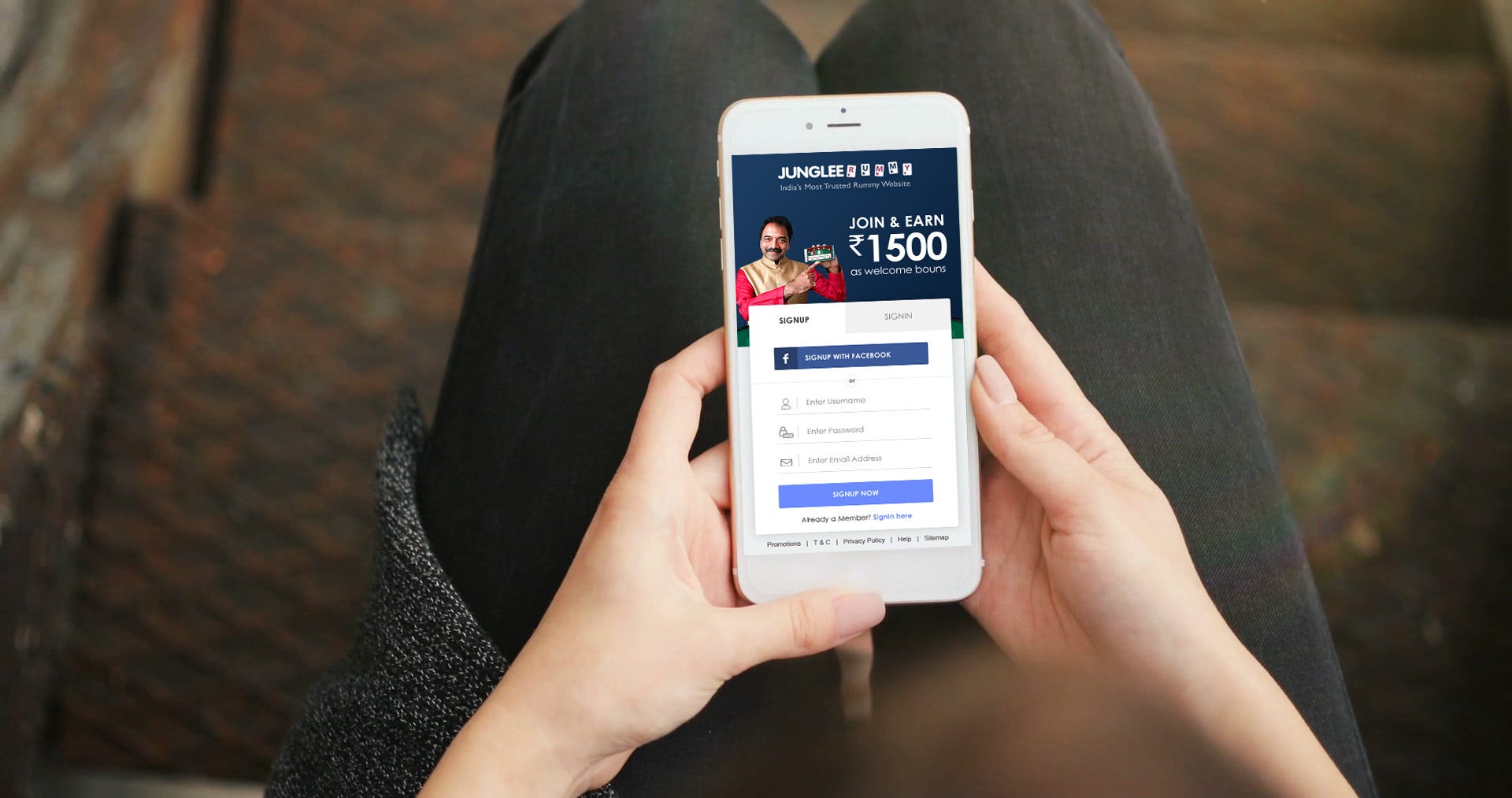
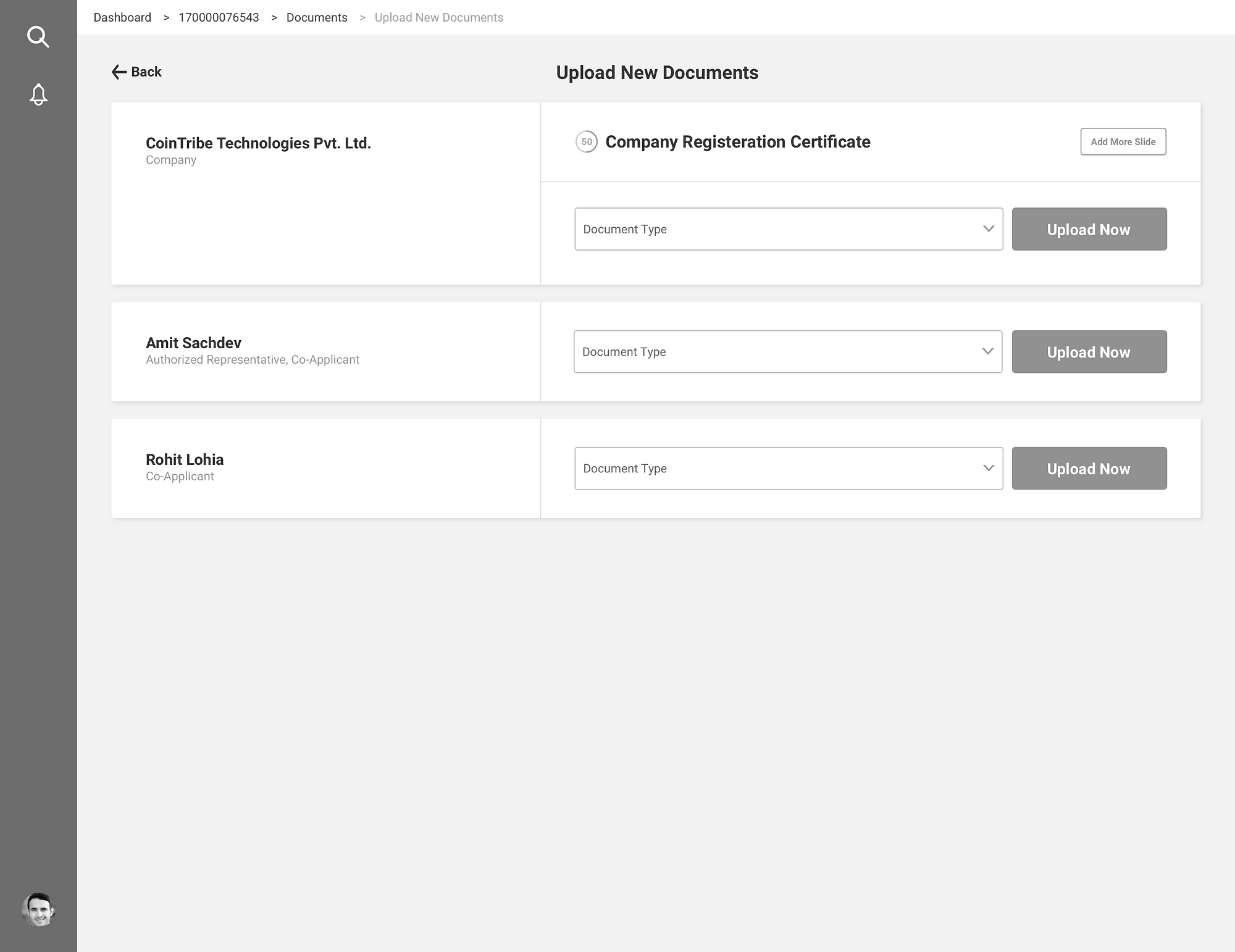
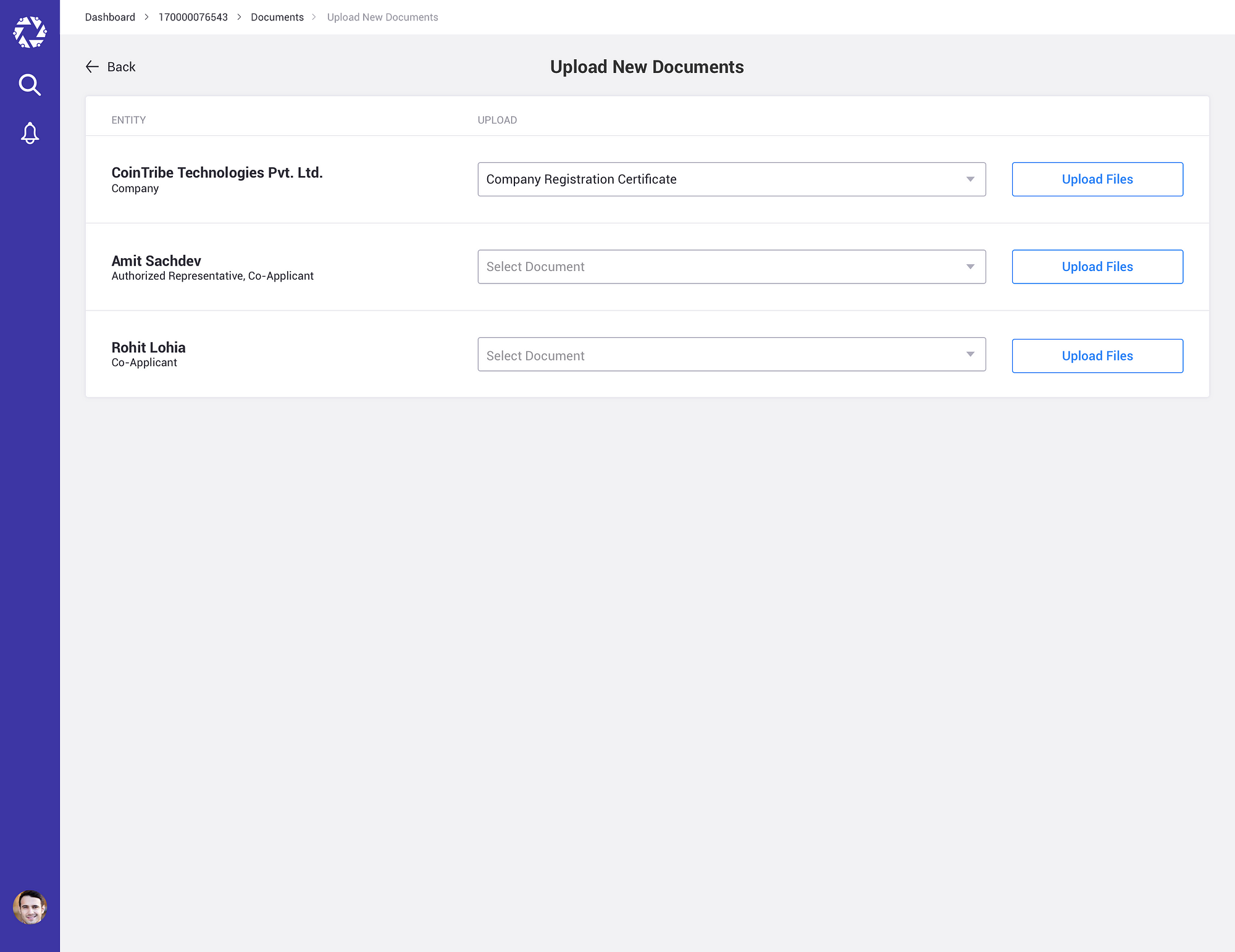
Task 1: Onboarding > Create an account

While Junglerummy.com opening screen is not very visually interesting. It is loaded with too much information (Prizes won, Promotions Banner, Login at the top, How it works at the bottom), which increase the Cognitive Load.
What is Cognitive Load:
The total cognitive load, or amount of mental processing power needed to use your site, affects how easily users find content and complete tasks.
You can register by providing the following information Username, Password and Email Address.
Below are some of positive points on Onboarding
- “Less is more” principle works perfectly here.
Their onboarding/registration is very simple and straight forward. Only most relevant info is require for registration. - Use of single column design layout for Form from better readability.
Problems on Onboarding
- Not using inline validation with real-time feedback immediately after answering: The last thing you want is for your user to realize they’ve made an error just after they’ve finished filling out a form and must now go back and correct them.
- All fields in registration form is Mandatory.
Instead of using * in placeholder, write “All fields are Mandatory”. It will reduce the Visual Load.
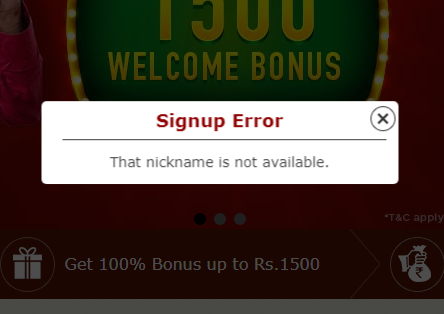
- Not Clear with error messages: After filling the entire form, I clicked on the “Register Now” button. It shows the Signup Error with Wrong Error message “That nickname is not available.” It should show “Username is not available.” So that User can build the relation with the input field.
- Not using labels outside the fields: Should not to hide the labels while answering, so the user will not loose the context. Also use placeholders in the fields as a hint text. You can show how the answer must look like — the format, structure, etc.
- Wrong Disclaimer: Instead of “By clicking “Play Rummy Now”, you agree to our T&C.” it should be “By clicking “register now”, you agree to our T&C.”
- We can remove the “Register via Facebook” because if user wants to use their Facebook account they can Facebook Login button at the top.
- Disclaimer text size is too small to read.
- Overloaded Information: Registration form is overloaded with the unnecessary information.
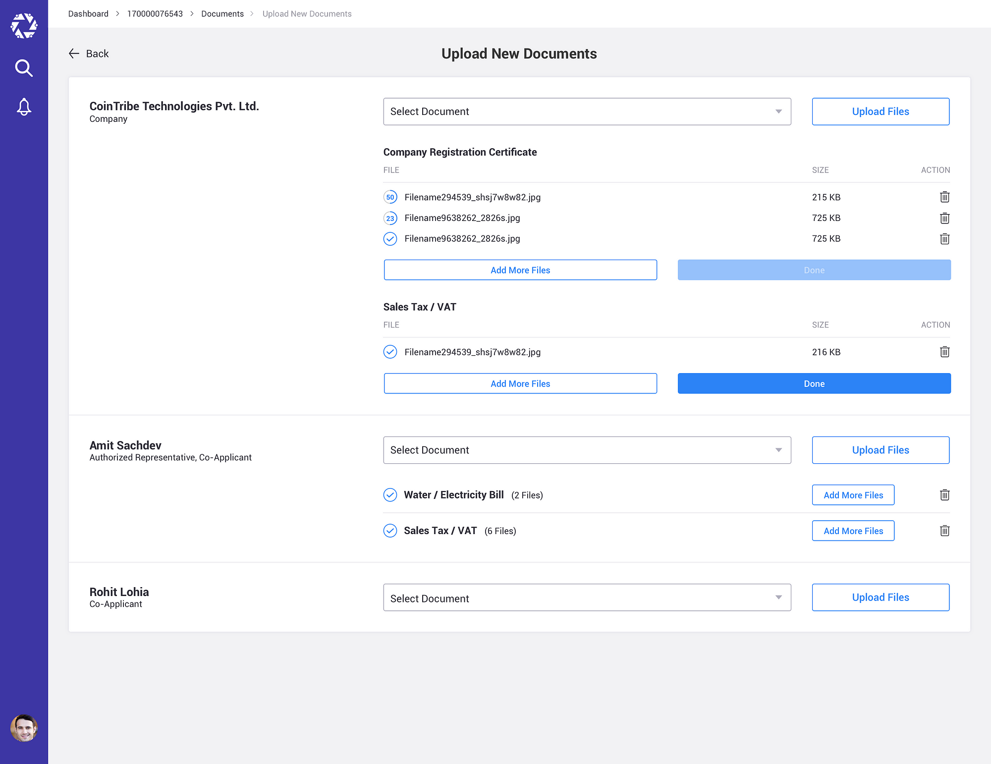
It takes me more than 6 mins to register with Jungleerummy.com.
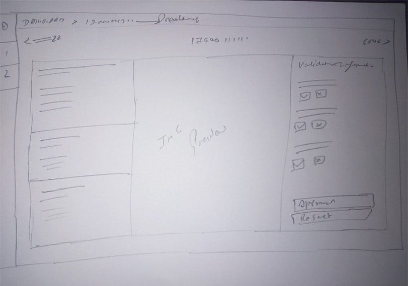
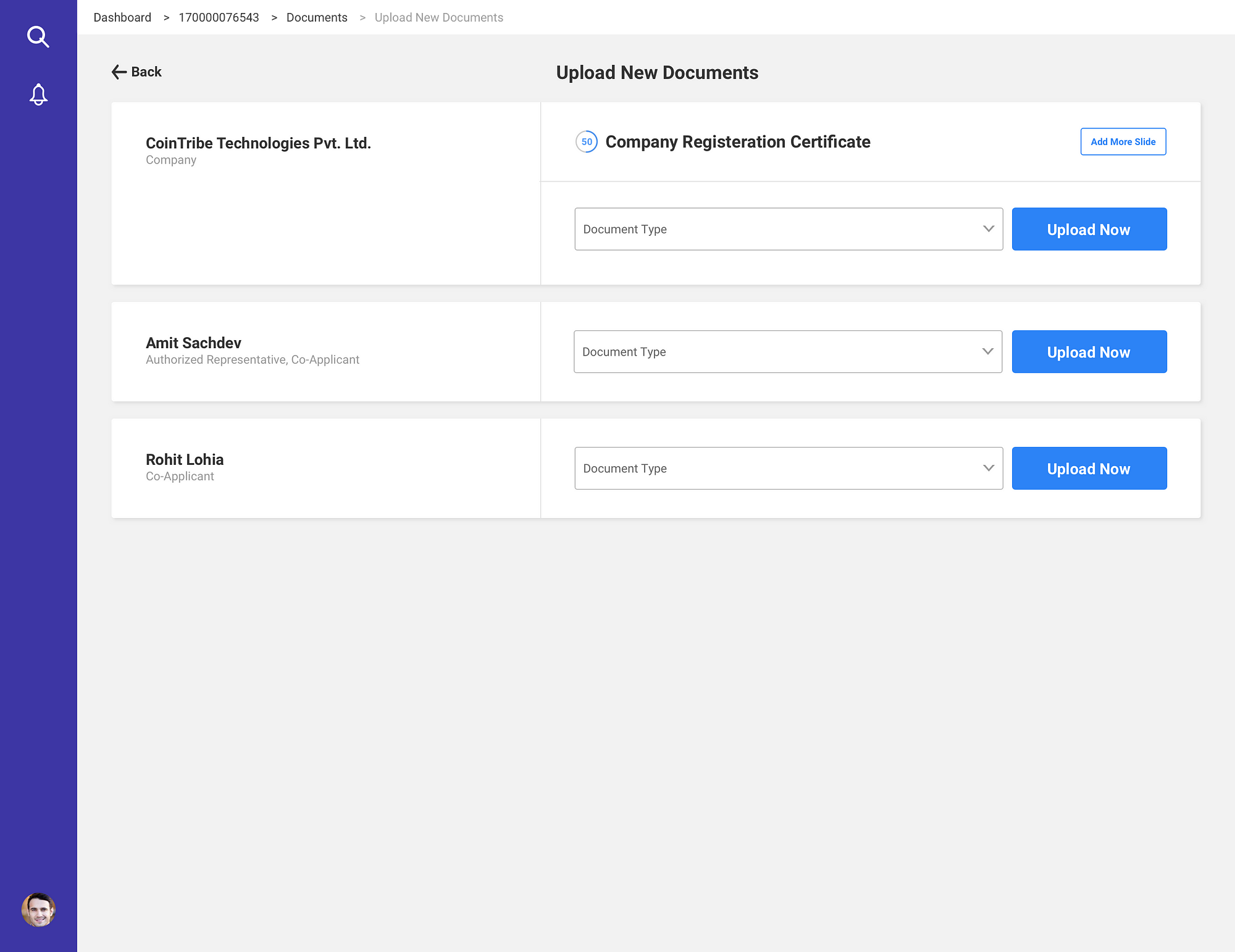
Task 2: On mobile rummy > Game Table Screen, What kind of UI changes you want to do and why?
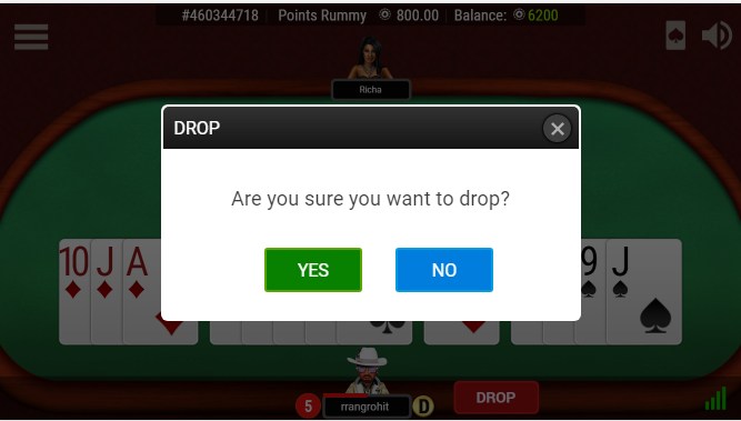
Below is the current game table view.
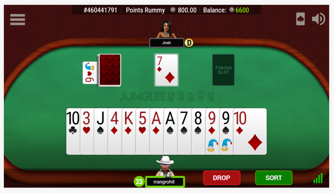
Based on the testing I have done with some of my 8 friends here are the list of UI Changes which we can implement in game table view.
- 6/8 users was not able to understand the timer and bar at first glance.
Recommendation: I would like to add the icon in front of time. So that user can able to understand that they need to take action before time out.
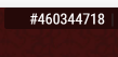
- 5/8 users was not able to understand the number(#460344718) at the top of the game table.
Recommendation: I would like to add the label in front of number. So that user can able to understand easily.
- Inconsistent Design: The current design is ignoring the Design principle called “Consistency in design”. Consistency is one of the molecules of the Design DNA.
It means, usability and learnability improve when similar elements have consistent look and function in similar way.
- In Current design Clickable elements and non clickable elements are in similar colors. Example In attached screenshot “YES” button is in green color which is clickable and the same color is used in the “Network Icon” which is non clickable element.
Recommendation: Use different color for non clickable elements - Popup UI is not matching with overall design.
- Unnecessary use of colors: In Current design Some buttons are in green, some are in blue, some in red.
Recommendation: You can define primary and secondary color of buttons and use them through out the site. - 8/8 users feels than their display cards are bigger in per-portion to table area.
- Error messages are not placed properly and even it is in very small fonts. It is very hard to read and understand error message.
- I would like to change the direction of user face towards the cards. So that user will feel that he/she is current playing the game.
- I would like to change the camera view of table and design of table area. So that it will look aesthetically good. Check below image for reference.
Task 3: On mobile rummy > How can you change the Game Table UX without changing UI?
Most of the point I have covered at the task 2 stage. Below are some more points.
- We can add label against non common icons and elements like Card icon at the top right.
- We can add the Help/How to play tutorial of the first time user. So that new user can understand/learn how to play the rummy game.
- We can remove the Hamburger icon form game area and show the menu upfront. So that user can easily access the menu/items and take decision.
- We can add “Invite friend” functionality. So that if user want to play the game with friends. They can use this feature.
- Tap-able area of the button is small and it is not as per the android guidelines.
Task 3: On mobile rummy > Create and inviting / attractive home screen design for m.jungleerummy.com
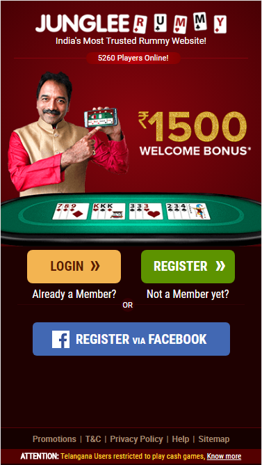
Below are my observations of current homepage design of mobile screen/website .
- Visual Hierarchy
One of the most important attribute of Great/Quality UI is Visual Hierarchy. A great User Interface allows users to focus on what is important.
In current design > you are trying to make everything look important and you just create information overload and reduce the quality of the User experience. In this page the current user will not able to make a decision, what is the main task in this screen(Login, Register, or Register via Facebook). - Currently, All three main action items is having the some visual important and there is no contrast between the different sizes of button and placements.
A well designed visual hierarchy reduces the appearance of complexity and helps users accomplish their tasks. - Simplicity
Before designing any interface/ product, we should ask our self one question “Does the user really need this to compete their task?” before adding features and content. A quality user interface is made up of necessary elements that are logical and concise.
Currently > The interface is not simple overloaded with a lots of actionable items.
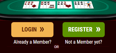
4. The information architecture of current design is broken or not familiar with user. You add label after the button “Login Already a member?” instead of this you should use label first like, “Already a member Login here”. Which is common way in current design trends.
UPDATED DESIGN
Based on the above mentioned points, I have made the changes in visual hierarchy and some inspiration for user to register on the website. Also I have made some changes in content of the page. Below is my updated design.